
In the vast digital landscape, where attention spans are short and competition is fierce, the layout of a website holds immense significance. It’s not just about aesthetics; it’s about creating an intuitive, engaging, and user-friendly experience that captivates visitors and drives them toward desired actions. The dos and don’ts of website layout design serve as guiding principles to navigate this intricate terrain, ensuring that every pixel contributes to the effectiveness and success of the website.
This comprehensive guide explores the fundamental principles of website layout design, delving into the dos and don’ts that shape the visual presentation, usability, and overall user experience. From establishing a clear hierarchy and organization to avoiding cluttered and confusing layouts, each aspect of layout design plays a pivotal role in influencing user perception and behavior.
By understanding and adhering to these dos and don’ts, designers and businesses can create websites that not only look visually appealing but also function seamlessly and resonate with their target audience. Whether you’re embarking on a new web design project or seeking to enhance an existing website, this guide will provide valuable insights and practical guidelines for creating layouts that captivate, engage, and inspire action.
Join us as we explore the dos and don’ts of website layout design, unlocking the secrets to creating compelling, user-centric web experiences that leave a lasting impression.
Dos of Website Layout Design
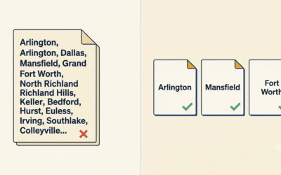
One of the fundamental principles of effective website layout design is establishing a clear hierarchy and organization of content. Users should be able to quickly and intuitively understand the structure of the website and navigate to the information they seek without confusion. To achieve this, prioritize content based on importance and relevance, using visual cues such as size, color, and placement to guide users’ attention. Headings, subheadings, and bullet points can help break up content and create a logical flow, enhancing readability and comprehension.
Consistency is key to creating a cohesive and memorable user experience. Maintain consistency in branding elements such as logos, color schemes, typography, and imagery throughout the website. Consistent branding not only reinforces brand identity but also helps users feel familiar and comfortable navigating the site. By adhering to established brand guidelines, designers can create a unified visual identity that strengthens brand recognition and builds trust with users.
In today’s mobile-driven world, responsive and mobile-friendly design is essential for ensuring that websites are accessible and usable across devices of all sizes. Design layouts that adapt fluidly to different screen sizes and resolutions, ensuring a seamless experience for users on smartphones, tablets, and desktops. Prioritize mobile optimization by simplifying navigation, optimizing page load times, and ensuring that all content is easily accessible and readable on smaller screens. A responsive design not only improves user experience but also boosts search engine rankings and increases engagement and conversions.
Intuitive navigation is critical for guiding users through the website and helping them find the information they need efficiently. Design navigation menus that are clear, consistent, and easy to understand, using familiar patterns and conventions to minimize cognitive load. Organize content logically and provide multiple pathways for users to navigate between pages and sections of the site. Consider user flow when designing layouts, anticipating the user’s journey and ensuring that each step is intuitive and seamless.
White space, also known as negative space, is the area between design elements on a webpage. It plays a crucial role in creating visual balance, enhancing readability, and drawing attention to key content. Use white space strategically to break up sections of content, improve legibility, and create a sense of openness and clarity. Avoid overcrowded layouts that overwhelm users and detract from the user experience. By incorporating ample white space into design layouts, designers can create a more inviting and engaging user experience.
Content readability and legibility are paramount for ensuring that users can easily consume and understand the information presented on a website. Choose legible fonts, appropriate font sizes, and sufficient contrast between text and background colors to enhance readability. Pay attention to line spacing, paragraph length, and text alignment to improve legibility and reduce eye strain. Prioritize content readability over decorative flourishes or complex design elements, ensuring that users can access and comprehend the content quickly and effortlessly. By emphasizing content readability and legibility, designers can create layouts that are user-friendly, accessible, and engaging.
Don’ts of Website Layout Design
Avoid cluttered and overcrowded layouts that overwhelm users with an excessive amount of content, graphics, or design elements. A cluttered layout can confuse users and make it difficult for them to find the information they need. Keep the design clean and organized, prioritizing essential content and minimizing visual distractions. By decluttering the layout, designers can create a more focused and user-friendly experience that enhances engagement and usability.
Consistency is key to creating a cohesive and memorable user experience. Avoid using inconsistent branding elements, such as logos, colors, typography, and imagery, as this can undermine brand recognition and confuse users. Stick to established brand guidelines and design principles throughout the website to maintain a unified visual identity. Consistent branding helps build trust with users and reinforces brand recognition, contributing to a more polished and professional-looking website.
With the increasing prevalence of mobile devices, ignoring responsiveness and mobile optimization is a critical mistake in website layout design. Neglecting mobile optimization can alienate a significant portion of users and hinder accessibility and usability. Design layouts that adapt seamlessly to different screen sizes and resolutions, ensuring a consistent and user-friendly experience across devices. Prioritize mobile optimization by simplifying navigation, optimizing page load times, and ensuring that all content is easily accessible and readable on smaller screens.
Confusing or non-intuitive navigation can frustrate users and impede their ability to find information efficiently. Avoid complex navigation structures or hidden menu items that require users to guess or click through multiple pages to find what they’re looking for. Design navigation menus that are clear, consistent, and easy to understand, using familiar patterns and conventions to minimize cognitive load. Organize content logically and provide multiple pathways for users to navigate between pages and sections of the site.
White space, also known as negative space, is essential for creating visual balance and improving readability in website layout design. Avoid layouts that lack sufficient white space, as this can make content difficult to digest and diminish visual appeal. Use white space strategically to break up sections of content, improve legibility, and create a sense of openness and clarity. By incorporating ample white space into design layouts, designers can create a more inviting and engaging user experience.
While aesthetics are important, sacrificing content readability for the sake of visual appeal is a common pitfall in website layout design. Avoid overly stylized fonts, color combinations, or design elements that hinder content readability. Choose legible fonts, appropriate font sizes, and sufficient contrast between text and background colors to enhance readability. Prioritize content readability over decorative flourishes or complex design elements, ensuring that users can access and comprehend the content quickly and effortlessly. By maintaining a balance between aesthetics and readability, designers can create layouts that are both visually appealing and user-friendly.
Final Thoughts
The dos and don’ts of website layout design serve as essential guidelines for creating visually appealing, user-friendly, and effective websites. By adhering to best practices such as establishing a clear hierarchy, maintaining consistent branding, prioritizing responsiveness, ensuring intuitive navigation, incorporating ample white space, and emphasizing content readability, designers can create layouts that captivate and engage users while delivering a seamless and satisfying user experience.
Effective layout design is not just about aesthetics; it’s about creating an experience that resonates with users and drives website success. A well-designed layout can enhance brand perception, increase user engagement, boost conversions, and ultimately contribute to the overall success of a website.
At PC Designs, we understand the importance of effective layout design in creating engaging and user-friendly websites. Our team of experienced designers specializes in crafting layouts that prioritize user experience, usability, and visual appeal. Whether you’re launching a new website or looking to redesign an existing one, we can help you create a layout that meets your needs and exceeds your expectations.
Contact PC Designs today to learn more about how we can assist you in creating engaging, user-friendly websites with effective layout design. Don’t miss out on the opportunity to elevate your online presence and deliver exceptional user experiences. Let us help you make your website stand out in the digital landscape.