Imagine walking into a store where everything is confusing—no signs, no clear checkout, just chaos. That’s what a bad landing page feels like. Your landing page is like a digital storefront. If it’s not clear, people leave.
A landing page isn’t just another webpage. It has one job: to turn visitors into customers. Whether you want people to sign up for your newsletter, book a call, or make a purchase, a well-designed landing page guides them to take that action without distractions. In this guide, we’ll break down exactly how to create a landing page that works.
What Is a Landing Page (And Why Should You Care?)
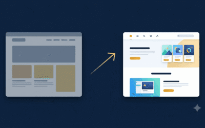
A landing page is a single webpage designed to get visitors to take one specific action. Unlike a full website that has multiple pages and distractions, a landing page focuses on conversion. It removes unnecessary links, navigation bars, and anything that might take attention away from the goal.
Think of it like this—if a full website is a giant grocery store where customers wander through aisles, a landing page is a well-organized drive-thru that takes them straight to what they need. When done right, it’s a powerful tool for generating leads, sales, and sign-ups.
The Anatomy of a High-Converting Landing Page
Just like a great meal needs the right ingredients, a high-converting landing page needs specific elements to be effective. Here’s what every successful landing page should have:
A compelling headline grabs attention in five seconds or less. It should be short, clear, and tell visitors exactly what they’ll get. For example, “Get More Leads in 30 Days – Without Spending a Fortune” is direct and benefit-driven.
A clear, benefit-driven subheadline reinforces your main message and explains how your offer helps the visitor. It should complement the headline and add more clarity.
An engaging hero image or video is important because people process visuals faster than text. Show your product or service in action or use an image that helps visitors visualize the result they’ll get.
A strong call-to-action (CTA) is the most critical part of your page. This is the button that tells people exactly what to do next. Instead of generic text like “Submit,” use action-oriented wording like “Get Your Free Quote” or “Start Your Free Trial.”
Minimal distractions make a huge difference. Avoid clutter, unnecessary links, or too much information. The more choices visitors have, the less likely they are to take action. Keep it simple.
The Psychology Behind Landing Page Conversions
A good landing page isn’t just about design—it’s about understanding how people think. Here’s how to use psychology to boost conversions:
Keep it simple. Too many choices lead to decision paralysis, where people do nothing instead of picking an option. Your page should focus on one clear goal.
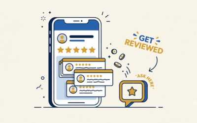
Use social proof. People trust other people. Adding testimonials, reviews, or trust badges can help visitors feel confident about taking action. For example, a statement like “Over 5,000 businesses trust us” reassures potential customers.
Create a sense of urgency. If people think they have unlimited time to act, they’ll procrastinate. A limited-time offer or a countdown timer encourages them to take action now.
Address pain points and offer solutions. Your landing page should answer the visitor’s biggest question: “What’s in it for me?” Instead of listing features, focus on the benefits. For example, instead of saying “We offer marketing automation,” say, “Save 10+ hours a week with automated marketing.”
Common Landing Page Mistakes That Kill Conversions
Even small mistakes can cost you conversions. Here are some of the most common errors and how to avoid them:
A weak or confusing headline makes visitors leave because they don’t immediately understand what you’re offering. Your headline should be clear, benefit-driven, and attention-grabbing.
Too many CTAs can confuse visitors. If your page has multiple buttons leading to different places, people won’t know what to do. Stick to one primary CTA.
Slow load time is a major issue. Studies show that even a one-second delay in page load time can lead to lost customers. Optimize images, remove unnecessary scripts, and use a fast hosting provider.
No mobile optimization is a big mistake since most web traffic comes from mobile devices. If your landing page isn’t easy to navigate on a phone, you’re losing potential leads.
Forgetting to test and improve can hurt your conversions. A/B testing different headlines, CTAs, and colors can help you find what works best. Don’t assume—test everything.
Real-World Examples of Great Landing Pages (And Why They Work)
Some of the most successful companies use simple yet powerful landing pages. Here are a few examples:
Dropbox keeps it minimal with a clean design, one CTA, and a clear value proposition.
Airbnb uses trust factors like reviews, stunning visuals, and an easy-to-use booking CTA.
HubSpot makes great use of strong headlines, benefit-driven content, and a simple form that doesn’t overwhelm visitors.
How to Create Your Own High-Converting Landing Page (Without the Headache)
If you’re ready to build a landing page that actually converts, follow these steps:
Step 1: Choose a landing page builder. Tools like Divi, Elementor, Unbounce, and Leadpages make it easy to design and launch your page without coding.
Step 2: Use a proven template. Don’t start from scratch. Find a high-converting template and customize it to fit your brand and offer.
Step 3: Write clear, persuasive copy. Keep your text simple, engaging, and benefit-focused. Avoid jargon and talk like a real person.
Step 4: Optimize for mobile and speed. Test your page on different devices and make sure it loads in under three seconds.
Step 5: Set up tracking and analytics. Use tools like Google Analytics or Hotjar to see how people interact with your page and make improvements based on real data.
Time to Build Your Best Landing Page Yet!
A high-converting landing page isn’t about fancy design—it’s about guiding visitors to take action. When you keep it simple, focus on what your audience needs, and continuously test for improvements, you’ll see real results.
Now, go build that landing page and start turning visitors into customers!