You paid for a website. Maybe you even paid good money for it. It looks professional. Your logo is on it. Your services are listed. And yet, the phone isn’t ringing the way you expected. Visitors come. Visitors leave. Nothing happens.
This is the most common problem I see with small business websites in Arlington and across DFW. And here’s the uncomfortable truth: the design is usually not the problem.
The problem is that the website was built to look good, not to convert.
There’s a difference. A big one. And once you understand it, you’ll never look at a website the same way again.
The Difference Between a Pretty Website and a Profitable One
Most websites, especially those built by designers who prioritize aesthetics over strategy, are engineered for one moment: the reveal. The client sees the finished design, it looks polished and modern, everyone celebrates, and the site goes live.
Then nothing happens.
The reason is that a pretty website is built around the designer’s preferences and the business owner’s ego. A profitable website is built around one person: the visitor. Specifically, it’s built around how that visitor thinks, what they’re worried about, what they need to feel before they’ll pick up the phone, and what friction stands between them and taking action.
The most effective websites aren’t just designed. They’re engineered around human behavior.
That distinction, design vs. engineering, is everything. And it’s what separates websites that generate leads from websites that generate compliments.
7 Reasons Your Website Isn’t Converting
If your website is getting traffic but not generating leads, one or more of these is almost certainly the cause.
1. Your Messaging Fails the 5-Second Test
When someone lands on your homepage, they’re making a subconscious decision within seconds: Is this for me? Can these people help me? Do I trust them?
If your headline says something like “Welcome to [Business Name]” or leads with your founding year, you’ve already lost them. That information doesn’t answer the question the visitor is actually asking: What’s in this for me?
Your headline needs to communicate three things immediately: what you do, who you help, and what outcome you deliver. Not in a paragraph. In a sentence. The rest of the page is only read by people your headline didn’t lose.
- Bad: “Smith Contracting, Serving the DFW Area Since 2009”
- Better: “Residential Roofing in Arlington, TX, Inspections, Repairs, and Full Replacements”
- Best: “Arlington’s Most Reviewed Roofing Contractor, Free Inspections, Same-Week Estimates”
2. Your Call to Action Is Buried, Vague, or Absent
Most business websites have a “Contact Us” link in the navigation. That’s not a call to action. That’s a menu item.
A real call to action tells the visitor exactly what to do next and gives them a reason to do it right now. It appears above the fold. It repeats throughout the page. It removes ambiguity about what “next step” means.
“Schedule a Free Estimate” converts better than “Contact Us.” “Get Your Free 15-Minute Consultation” converts better than “Learn More.” The specificity signals that you’ve thought about their experience, which builds trust before they’ve even clicked.
Every page on your website should have one primary action you want the visitor to take. When everything competes for attention, nothing wins.
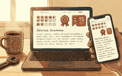
3. You’re Missing Trust Signals at the Moments They Matter Most
People don’t convert when they feel uncertain. They convert when they feel confident. And confidence comes from proof.
The problem is that most business websites either have no social proof, or they stack all of it on one testimonials page nobody visits. Trust signals need to be placed at the exact moments in a visitor’s journey when doubt naturally arises.
Someone is reading about your services and wondering: “Are these people actually good?” That’s where a testimonial goes. They’re looking at your pricing and wondering: “Is this worth it?” That’s where a case study result goes. They’re about to fill out the contact form and wondering: “Will anyone actually respond?” That’s where your response guarantee goes.
Trust signals that move the needle:
- Google reviews with real names and specific details (not generic praise)
- Before/after examples or case studies with actual numbers
- Logos of recognizable clients or partners
- Certifications, memberships, or awards relevant to your industry
- A real photo of you or your team, not stock photography
- Your physical address and local phone number prominently displayed
4. The Mobile Experience Is an Afterthought
More than 60% of web traffic now comes from mobile devices. For local service businesses in the DFW area, where people are searching while they’re at work, in their car, or watching TV, that number is often higher.
A website that works beautifully on a desktop but frustrates on a phone is actively destroying your conversion rate. Tiny text. Buttons too small to tap. Forms that require horizontal scrolling. Images that break the layout. These aren’t minor annoyances, they’re signals to the visitor that you don’t care about their experience.
Google also uses mobile page speed as a ranking factor. A bad mobile experience doesn’t just cost you conversions. It costs you visibility.
5. Your Page Speed Is Killing You Before the First Word Loads
The research on this is unambiguous: 53% of mobile visitors abandon a site that takes longer than 3 seconds to load. For every additional second of load time, conversions drop meaningfully.
Slow websites are usually the result of unoptimized images, too many plugins, cheap shared hosting, or no caching layer. These are fixable problems. But they require someone to actually fix them, which means either you need to know what to look for, or you need someone who does.
Test your site at PageSpeed Insights (free, from Google). If you’re scoring below 50 on mobile, you have a measurable conversion problem that has nothing to do with your design or your copy.
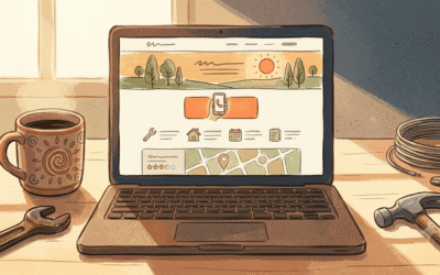
6. Your Navigation Creates Confusion Instead of a Path
Every additional choice you give a visitor is a potential exit point. Navigation menus with 10 items, dropdowns with 20 sub-pages, sidebars full of links, these feel comprehensive to the business owner who built them and overwhelming to the visitor who just wants to know if you can fix their HVAC.
Good navigation design is about ruthless prioritization. What are the three or four things a visitor most needs to find? Build the navigation around those things. Hide everything else or eliminate it.
The goal is to create a clear, obvious path from “I just landed here” to “I just submitted a contact form.” Every page, every link, every button should either advance the visitor along that path or get out of the way.
7. Your Copy Talks About You Instead of Your Customer
This is the most common mistake I see on small business websites, and it’s also the easiest to fix once you know what to look for.
Read your homepage copy right now. Count how many times you use the words “we,” “our,” and “us” versus “you” and “your.” If the business is the subject of most of your sentences, you have a copy problem.
Visitors don’t care about your business. They care about their problem. They want to know if you understand what they’re going through and whether you can make it better. Lead with their situation. Lead with their frustration. Lead with the outcome they want, and then explain how you deliver it.
“We’ve been serving Arlington since 2008” tells a visitor nothing useful. “When your HVAC breaks in a Texas summer, we pick up the phone and show up the same day” tells them everything.
You Don’t Always Need a Full Redesign
Before you assume you need to rebuild everything from scratch, know this: the biggest conversion wins often come from fixing the fundamentals on your existing site.
A sharper headline. A more specific call to action. Three testimonials placed in the right spots. A contact form moved above the fold. A page speed optimization that gets your load time under 2 seconds.
These changes cost a fraction of a full redesign and can produce measurable results in days, not months. Start with what’s broken before you decide everything needs to be replaced.
The right question isn’t “Do I need a new website?” The right question is “What is my website currently costing me in lost leads, and what’s the fastest way to fix that?”
What to Do Right Now
Here’s a simple audit you can run on your own site this week. For each item below, score yourself honestly on a scale of 1-3. If you’re below a 2 on any of them, you’ve found a conversion problem worth fixing.
- Does your homepage headline clearly communicate what you do and who you help within 5 seconds?
- Is there a specific, visible call to action above the fold on your homepage?
- Do you have at least 3 real testimonials with names and specific outcomes on your homepage?
- Does your site load in under 3 seconds on a mobile device?
- Is your contact form or phone number easy to find on mobile without scrolling?
- Does your navigation have fewer than 6 primary items?
- Does your homepage copy focus more on the customer’s problem than your company’s history?
If you scored yourself honestly and found three or more weak spots, your website is actively costing you leads right now. Not hypothetically. Today.
The Bottom Line
A beautiful website can open the door. It creates a first impression that either earns trust or erodes it. Design matters.
But design alone doesn’t close the sale. Clarity closes the sale. Trust closes the sale. Speed closes the sale. A page that answers the right questions in the right order at the right moment, that closes the sale.
The websites that actually work for DFW small businesses aren’t the ones with the most animations or the most impressive portfolio photography. They’re the ones that make it easy for the right person to take the right next step.
Pretty doesn’t pay. Performance does.
About the Author
Dyllon is the founder of PC Designs, an Arlington, TX web design and digital marketing agency specializing in conversion-focused websites and local SEO for DFW small businesses. He writes Behind the Build, a weekly newsletter on real web design decisions for business owners who take their growth seriously.
Ready to find out what your website is costing you?
PC Designs offers a free 30-minute website strategy call for Arlington and DFW business owners. We’ll review your current site, identify your biggest conversion problems, and tell you exactly what we’d fix first, no obligation.
→ Schedule your free strategy call at pcdesignstx.com/contact